Pick a theme
Create a palette of 2-3 colors, select a limited range of fonts (title, subtitle, paragraph text).
You can apply the theme book wide, or on a per section basis. For instance, your sports section can be themed to uniform colors, and portrait pages use a single texture of a background in a rainbow of colors.
See below to learn more about themes.
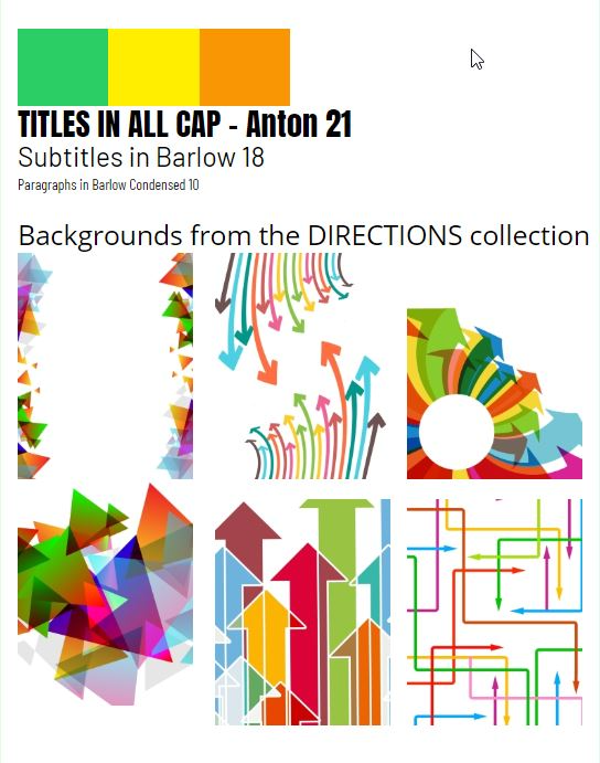 | 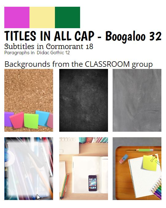 | 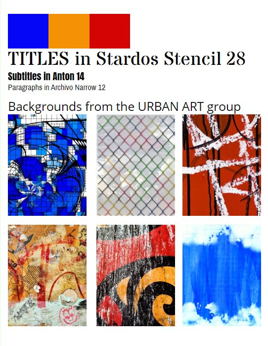 |
Don't clutter your page
The focus of your yearbook is the photos and text you use on your page - not all the fun backgrounds and clip art. To keep your book tidy, use Memento Yearbook's layout as a starting point. Many designs include "negative space" around the photos and text, to give the page breathing room and allow the reader to appreciate the content.
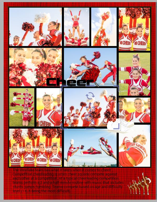
Keep areas with text clean, or frame them out with a background shape, so they are legible. Use only your absolute best photos, as few as possible: every extra photo on a page makes the other photos less impactful. A page cluttered with dozens of photos means that no one person will be visible in any photo - you aren't capturing a memory of a time and place if you can't see any details.
| A cluttered page: too many photos, clipart over the images, and unreadable text on a dark background. | Getting better: using a template to give the page some breathing room improved the visibility of the images, which have been added selectively. Text still is hard to read. | Best: selective images, clear text, simple and easy to enjoy. |
 | 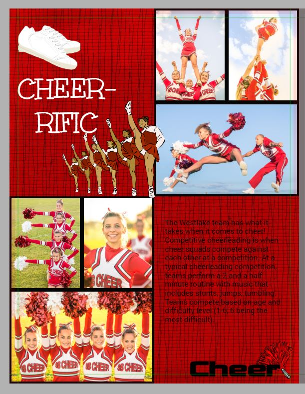 | 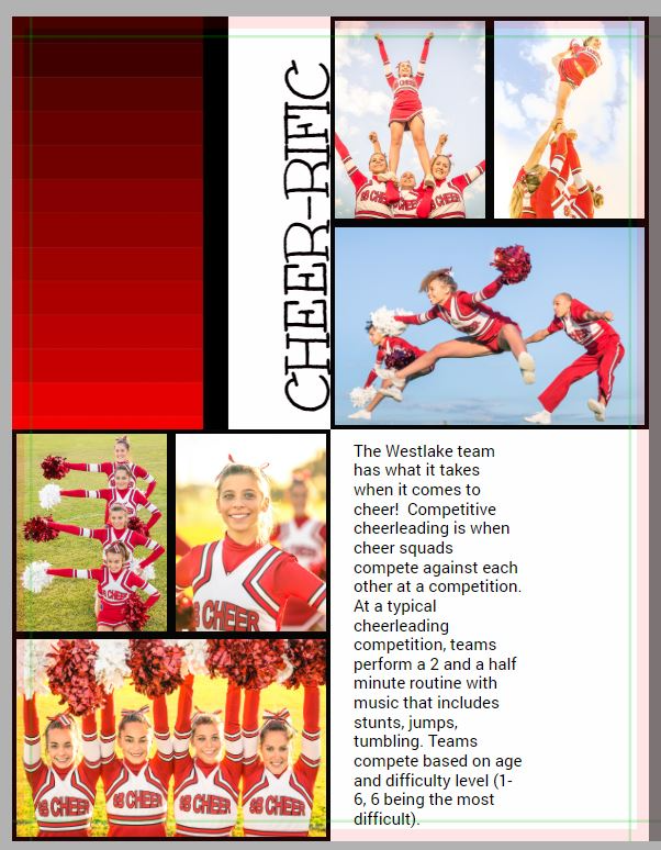 |
Text Visibility
| Invisible text: using a strong background with text makes it very hard to read. | Use shapes in a coordinating solid color (with reduced transparency too) to make a block around the text. |
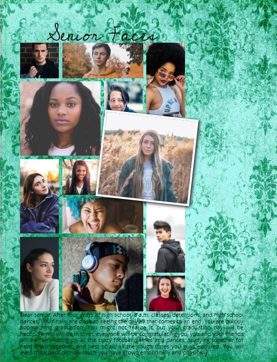 | 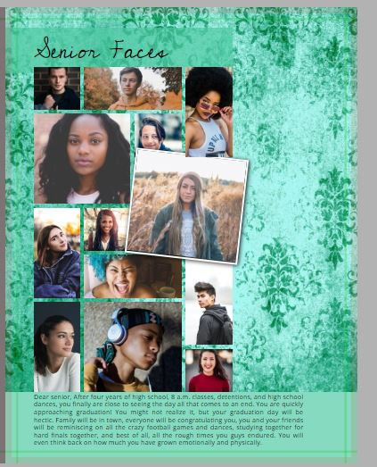 |
Creative Directions for Theming Your Book
While there are no limits to your choices when it comes to designing your book, styling usually follows one of five major design directions. Any style is suitable for any grade level. Your choice of decoration will set the age-appropriate tone.
Collage Style
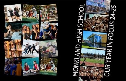
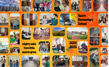
Collage style focuses on photos – the more the better. Decoration and text is minimal, in preference for grids or jumbles of candid images. Because there are so many photos, keeping colors and background textures simpler will enhance the design.
 |  |
Modern Minimalism
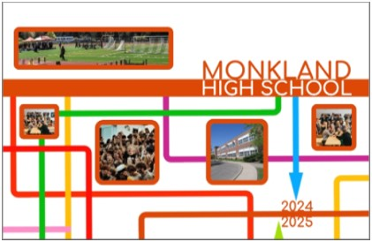
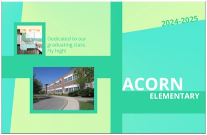
Modern minimalism makes use of color blocking and a limited color palette. Ample use of negative space – empty areas around elements on the page– allows for titles and feature images to stand out. Headline-style titles, open fonts, and strong geometric lines are featured.
 |  |
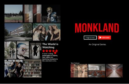
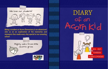
Parody / Tribute
Borrowing a style of another media source is challenging because care must be taken not to copy exact elements that are protected by copyright. While parody allows for creative freedom, you still need to make sure the tribute is clear without using the original characters, logos or specific designs. Learn more about copyright and licensing.
 |  |
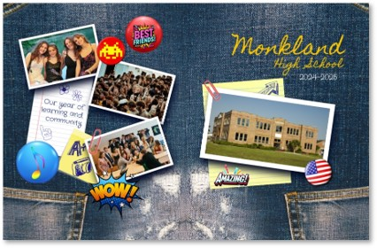
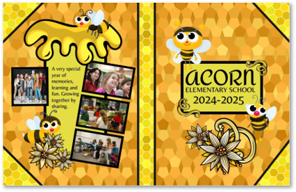
Scrapbook
Scrapbook style has a casual feel, layering photos, handwritten fonts, doodles, and decorations like stickers, tape and notepaper. It gives the impression of a personal, DIY project with a playful, less structured design.
 |  |
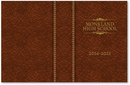
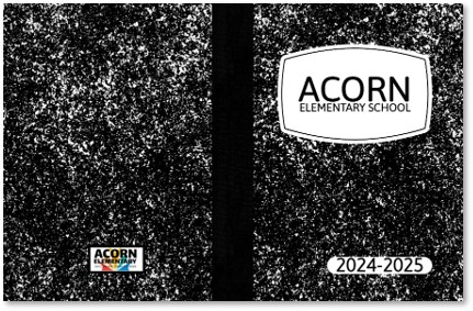
Traditional
Traditional style mimics a pre-digital yearbook. Leather, parchment and/or notebook backgrounds are combined with subtle titles. Fonts are straight-forward, not very decorative, and the color palette is very minimal.
 |  |
Was this article helpful?
That’s Great!
Thank you for your feedback
Sorry! We couldn't be helpful
Thank you for your feedback
Feedback sent
We appreciate your effort and will try to fix the article